One entry point: panel.plot
panel.plot(...) looks at what you give it and calls the matching typed method.
| You pass | It calls | You get |
|---|---|---|
a product path (str, list of str) or a VirtualProduct | plot_product | (plot, graph) |
a SpeasyVariable | plot_data | (plot, graph) |
arrays (x, y) or (x, y, z) | plot_data | (plot, graph) |
a function f(start, stop) | plot_function | (plot, graph) |
(x, y, z) with graph_type=GraphType.Waterfall | waterfall | (plot, waterfall) |
All of them take plot_index. It picks the plot that receives the new graph:
-1(the default), or any index past the end, appends a new plot.- An existing index draws into that plot, on top of what is there.
DENSITY_BRST = "speasy//cda//MMS//MMS1//DIS//MMS1_FPI_BRST_L2_DIS_MOMS//mms1_dis_numberdensity_brst"

p.plot(DENSITY)                       # a new plot
p.plot(DENSITY_BRST, plot_index=0)    # drawn on the same axes as the first plot
Anything else plot() cannot read raises ValueError: plot() could not interpret its arguments ....
Plotting a product: plot_product
plot, graph = p.plot_product(product, plot_index=-1, *, plot_type=PlotType.TimeSeries,
graph_type=GraphType.Line, product_inputs=None, **kwargs)productis a path or aVirtualProduct.plot_typeandgraph_typeare the only display options that work here.product_inputsgives initial values to the product’s parameters, the ones shown in the inspector. Unknown names are ignored.
The provider decides labels, the graph name and log scales. Passing labels= or a log-scale option for a product is
not supported. labels= raises TypeError.
An unknown path raises ValueError: cannot plot product '...': not found in the products tree, or its provider is unavailable.
Plotting arrays: plot_data
plot, graph = p.plot_data(x, y=None, z=None, plot_index=-1, *, labels=None, name=None,
                          plot_type=PlotType.TimeSeries, graph_type=GraphType.Line,
                          colors=None, y_log_scale=False, z_log_scale=False,
                          line_style=None, **kwargs)
What gets drawn depends on the shapes:
| Data | Result |
|---|---|
x 1-D, y 1-D | One line. |
x 1-D, y 2-D (len(x), n) | n lines, one per column. |
x 1-D, y 1-D, z 2-D (len(x), len(y)) | A colormap (spectrogram). |
a SpeasyVariable alone | Its time and values. With a numeric second axis, a colormap. |
Arrays are converted to float64 for you. numpy.datetime64 time arrays are converted to epoch seconds.
import numpy as np

t = np.arange("2015-10-16T10:00", "2015-10-16T16:00", np.timedelta64(10, "s"), dtype="datetime64[ns]")
y = np.column_stack([np.sin(np.arange(t.size) / 100), np.cos(np.arange(t.size) / 100)])
plot, graph = p.plot_data(t, y, labels=["sin", "cos"], name="demo")
A colormap from arrays:
energy = np.logspace(1, 4, 32)                    # must be ascending
flux = np.random.default_rng(0).random((t.size, energy.size))
plot, cmap = p.plot_data(t, energy, flux, y_log_scale=True, z_log_scale=True)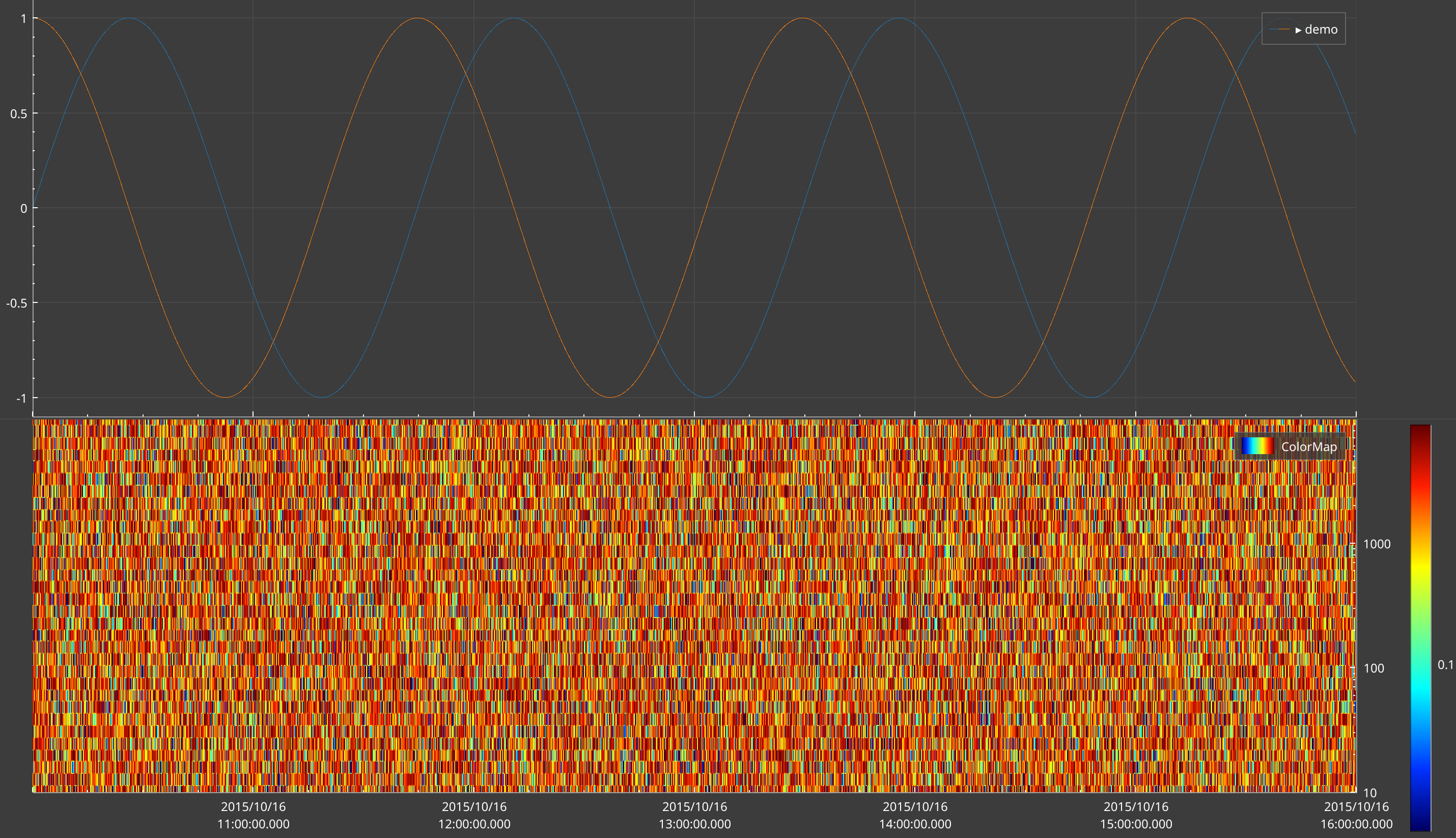
Colormap axes must be ascending
Both
xandyof a colormap must be sorted ascending. A descending energy table gives an empty or scrambled picture, not a flipped one. CDF energy tables are often stored high to low: flipyand the last axis ofz.
Plotting a Python function: plot_function
The function is called again every time the panel’s time range changes.
plot, graph = p.plot_function(f, plot_index=-1, *, labels=None, name=None,
                              plot_type=PlotType.TimeSeries, graph_type=GraphType.Line,
                              colors=None, y_log_scale=False, z_log_scale=False, **kwargs)
f(start, stop)gets epoch seconds as floats.- It returns
(x, y)for lines, or(x, y, z)withgraph_type=GraphType.ColorMapfor a colormap. - The number of lines comes from the returned data.
labelsonly names them. namedefaults to the function’s name, unless it is a lambda.
import speasy as spz

def b_total(start, stop):
    b = spz.get_data("cda/MMS1_FGM_SRVY_L2/mms1_fgm_b_gse_srvy_l2", start, stop)
    if b is None:
        return np.array([]), np.array([])
    t = b.time.astype("datetime64[ns]").astype("int64") / 1e9
    return t, np.ascontiguousarray(b.values[:, 3])   # a column view is strided: SciQLop drops it

plot, graph = p.plot_function(b_total, labels=["|B|"])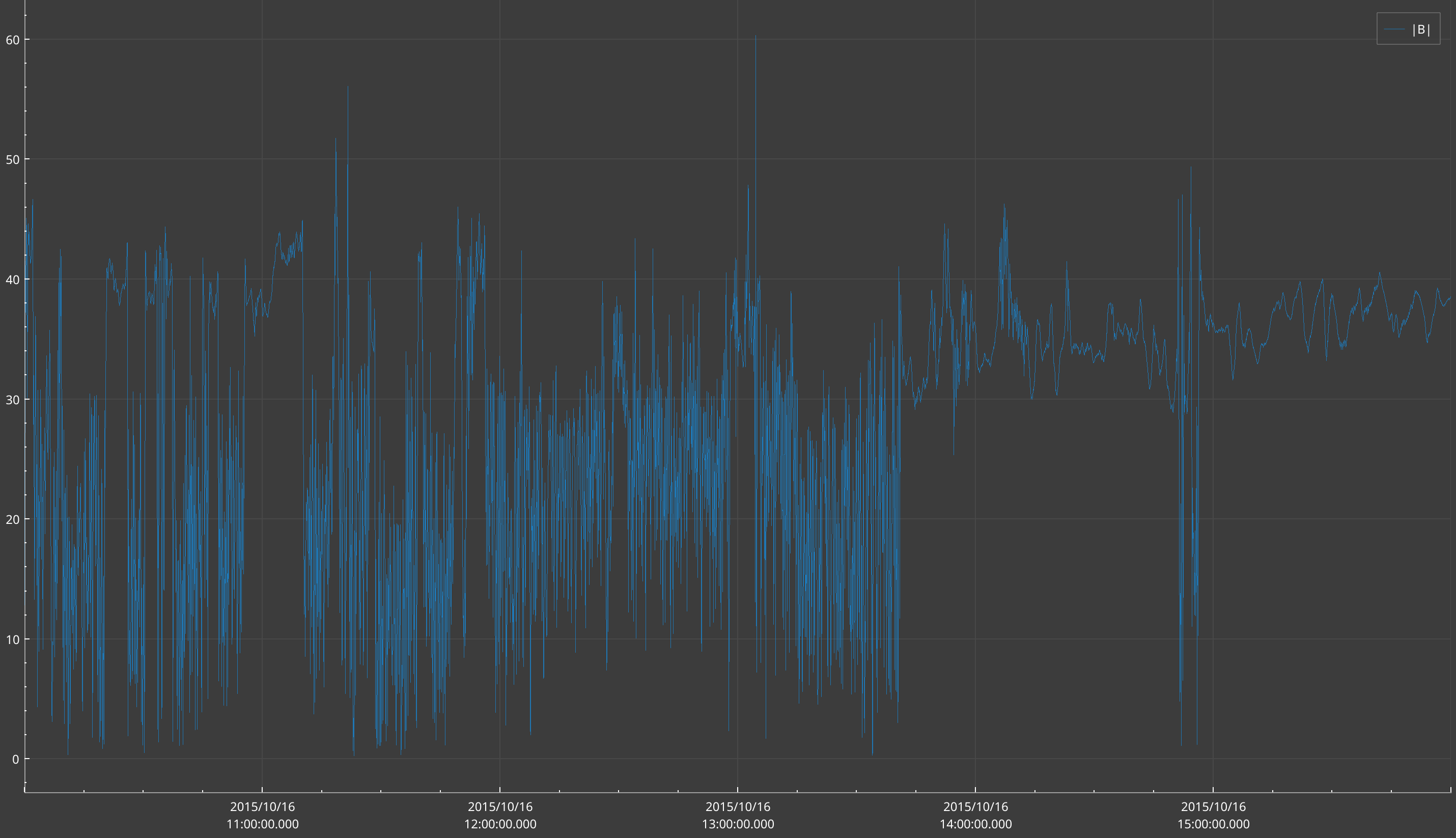
Return contiguous arrays. A column slice such as b.values[:, 3] is a strided view, and SciQLop drops it with
only a warning in the log, leaving the plot empty. Wrap it in np.ascontiguousarray(...).
If the function raises, the error shows as a red message over the plot. It goes away on the next successful call.
Function or virtual product?
plot_functionlives in one panel only. A virtual product appears in the Products tree, can be dragged anywhere, carries units and labels, and can be cached. Prefer a virtual product for anything you will reuse.
Plot types and graph types
plot_type picks the kind of plot created. graph_type picks how the data is drawn.
PlotType | Plot | X axis |
|---|---|---|
TimeSeries (default) | TimeSeriesPlot | time, shared by the panel |
XY | XYPlot | any quantity |
Projection | ProjectionPlot | several 2-D projections of vector data |
GraphType | Drawing |
|---|---|
Line (default) | A line. X must be sorted, which allows fast drawing. |
Curve | A parametric curve. X may go back and forth. |
ColorMap | A colormap. |
Scatter | Markers only. |
Waterfall | Stacked lines, through panel.plot(x, y, z, graph_type=GraphType.Waterfall). |
On an XY or Projection plot, plot_product, plot_data and plot_function always draw a Curve. The
graph_type you pass is replaced. For markers on an XY plot, use plot.scatter(x, y).
Next release
The
graph_typeyou pass is honoured:p.plot_data(x, y, plot_type=PlotType.XY, graph_type=GraphType.Scatter)draws markers. Withoutgraph_type, XY and projection plots still draw a curve.
Display options
These options are accepted by plot_data, plot_function and the plot() method of a plot. Always pass them by
keyword.
| Option | Effect |
|---|---|
labels=["Bx", "By", "Bz"] | Legend names, one per component. |
name="b_gse" | The graph’s name. |
colors=[QColor("red"), ...] | One colour per component. Defaults to the panel palette. |
y_log_scale=True | Log Y scale. |
z_log_scale=True | Log colour scale for a colormap. |
line_style=GraphLineStyle.Dash | Dash pattern: Solid, Dash, Dot, DashDot, DashDotDot. Not on plot_function. |
y_axis="y2" | Put the graph on the right-hand axis. Only on plot.plot(...), and only for lines, curves and scatter. |
gradient=... | Colour gradient of a colormap, passed through to SciQLopPlots. |
Waterfalls
A waterfall stacks one line per row of a matrix.
x = np.linspace(p.time_range.start(), p.time_range.stop(), 200)   # epoch seconds, inside the panel's window
y = np.linspace(0, 5, 12)
z = np.sin(np.linspace(0, 10, 200)) * np.exp(-y[:, None])         # shape (len(y), len(x))
wf = p.waterfall(x, y, z, name="stack", offsets=1.0, gain=1.0, normalize=False, color="#1f77b4")
wf.gain = 2.0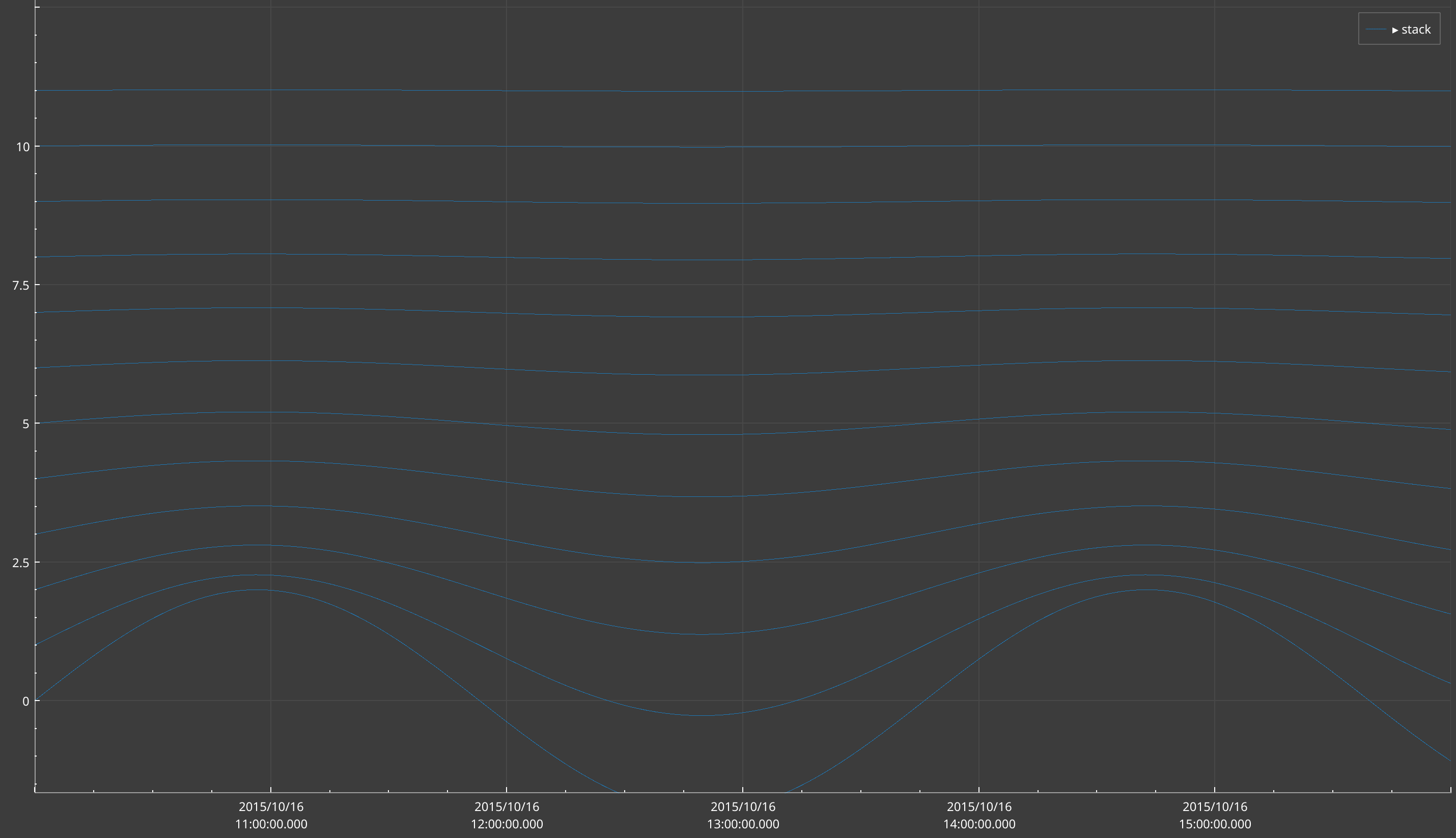
panel.waterfall(...) (experimental) returns the Waterfall only. XYPlot.waterfall(...) and
TimeSeriesPlot.waterfall(...) add one to an existing plot. A wrong z shape raises ValueError.
2D histograms
panel.histogram2d(...) bins (x, y) samples into a density map, in a new XY plot.
xy_plot, hist = p.histogram2d(x, y, name="histogram", x_bins=100, y_bins=100,
                              x_bin_strategy=BinStrategy.Linear, y_bin_strategy=BinStrategy.Linear,
                              z_log_scale=False, gradient=None, plot_index=-1)
Give it two arrays, or a function f(start, stop) -> (x, y) that follows the panel’s time range. The full story is
in 2D histograms.
x_binsandy_binsmust be integers. Explicit bin edges raiseNotImplementedErrorin v0.13.1.BinStrategy.Logworks.BinStrategy.SymLograisesNotImplementedErrorin v0.13.1.- More than 25 million cells, or fewer than one bin, raises
ValueError.
Next release
A histogram fed by a function loads as soon as it is created. In v0.13.1 it stays empty until the time range changes. Set
p.time_rangeafter creating it.
Fluent builder
fluent builds a panel in one chained expression. Each call returns the builder.
from SciQLop.user_api.plot import fluent

builder = (fluent.new_panel()
    .plot(FGM)
    .y_range(-75, 75)
    .subplot()
        .plot(DENSITY)
        .log_y()
        .y_range(0.1, 100)
    .time_range("2015-10-16T10:00", "2015-10-16T16:00"))

panel = builder.panel          # the underlying PlotPanel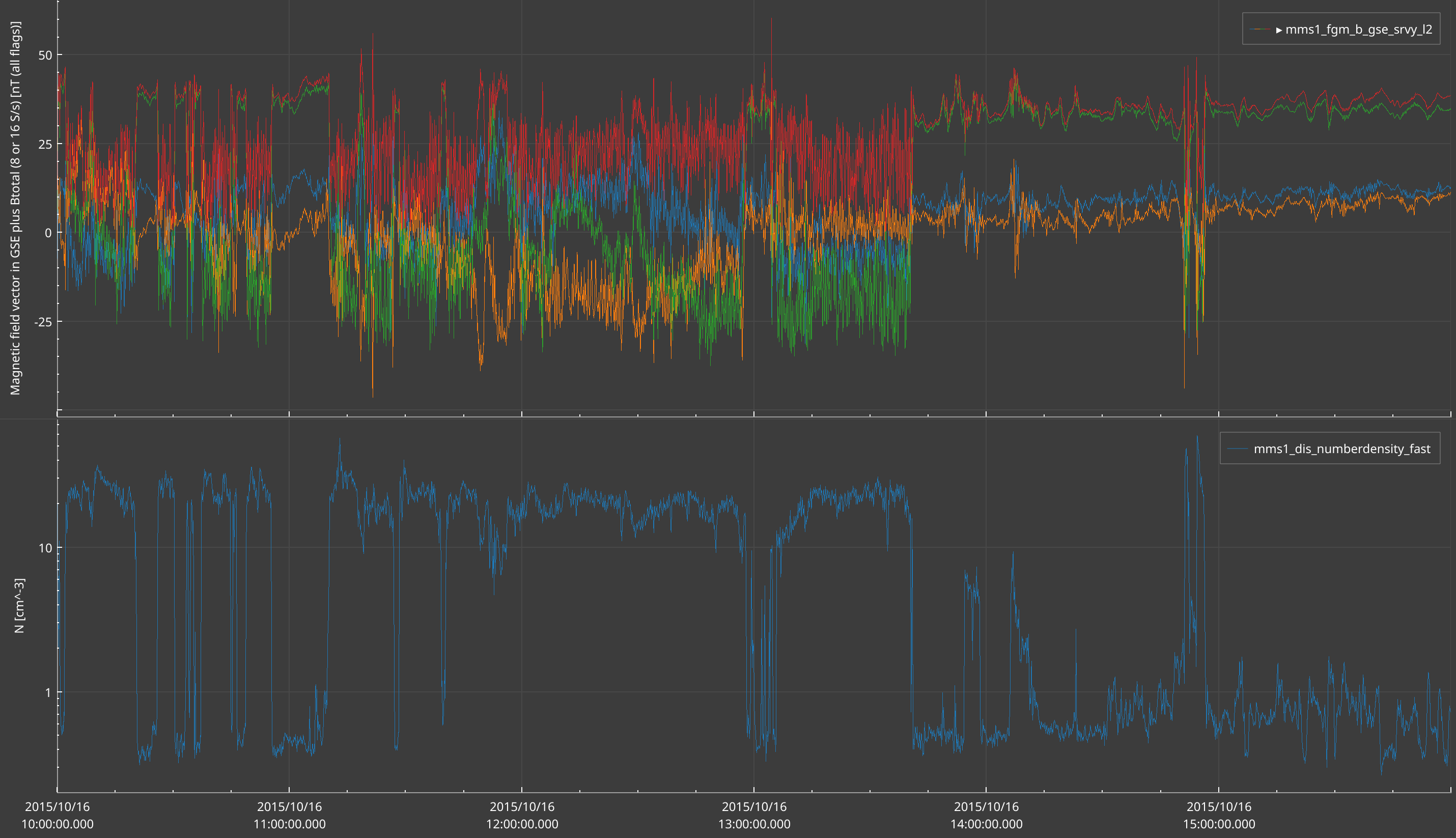
| Method | What it does |
|---|---|
fluent.new_panel() | Creates a panel and returns a builder. |
fluent.panel(name) | A builder over an existing panel. Unknown name raises ValueError. |
.plot(*args, **kwargs) | Same arguments as PlotPanel.plot. Adds to the current plot, or creates the first one. |
.subplot() | The next .plot() starts a new plot. |
.histogram2d(*args, **kwargs) | A 2D histogram in a new plot. |
.layer(func, **kwargs) | Attaches an annotation layer to the current plot. |
.y_range(lo, hi), .log_y(), .linear_y() | Y axis of the current plot. |
.time_range(start, stop) | The panel’s time range. |
.panel | The PlotPanel being built. |
Calling .y_range(), .log_y() or .layer() before any .plot() raises RuntimeError.