2D histograms
PlotPanel.histogram2d bins (x, y) samples into a density map. It is the tool for “is this one population or two?”
questions where a scatter plot would just be a blob. You can feed it static arrays, or a callback that SciQLop re-runs
every time the panel’s time range changes.
NOTE: SciQLop product paths are
//-separated (speasy//cda//MMS//...). Speasy’s ownget_datauses its usualcda/DATASET/parameterform. The example below uses both.
Ion density against perpendicular temperature
Three days of MMS1 FPI-DIS fast moments, 2015-10-16 to 2015-10-19. During that interval MMS1 crosses the magnetopause many times, so the ions come from two very different plasmas. Binning density against perpendicular temperature separates them.
import numpy as np
import speasy as spz
from SciQLop.user_api import TimeRange
from SciQLop.user_api.plot import create_plot_panel
from SciQLopPlots import ColorGradient

DIS = "cda/MMS1_FPI_FAST_L2_DIS-MOMS"


def density_vs_tperp(start, stop):
    """(log10 n, log10 T_perp) for the panel's current time range."""
    n = spz.get_data(f"{DIS}/mms1_dis_numberdensity_fast", start, stop)
    t = spz.get_data(f"{DIS}/mms1_dis_tempperp_fast", start, stop)
    if n is None or t is None:
        return np.array([]), np.array([])
    n, t = n.values.ravel(), t.values.ravel()
    ok = (n > 0) & (t > 0)
    return np.log10(n[ok]), np.log10(t[ok])


p = create_plot_panel()
xy_plot, hist = p.histogram2d(density_vs_tperp, x_bins=100, y_bins=100,
                              z_log_scale=True, gradient=ColorGradient.Hot)
xy_plot.set_axis_label("x", "log10 n", "cm^-3")
xy_plot.set_axis_label("y", "log10 T_perp", "eV")

# the density time series underneath shows which crossings feed the histogram
p.plot("speasy//cda//MMS//MMS1//DIS//MMS1_FPI_FAST_L2_DIS_MOMS//mms1_dis_numberdensity_fast")
p.time_range = TimeRange("2015-10-16T00:00:00", "2015-10-19T00:00:00")
Two clusters show up. Upper left is the magnetosphere: hot (keV) and tenuous (well under 1 cm⁻³). Lower right is the magnetosheath: cold (~100 eV) and dense (tens of cm⁻³). The thin track joining them is the boundary layer sampled during each crossing. Pan the time range and the histogram re-bins — narrow it to a single crossing and the track is all that is left.
Static arrays instead of a callback
If you already hold the samples, pass two arrays. The histogram is then fixed, but you can replace its data at any time.
rng = np.random.default_rng(0)
x, y = rng.standard_normal(20_000), rng.standard_normal(20_000)

p2 = create_plot_panel()
_, static_hist = p2.histogram2d(x, y, x_bins=60, y_bins=60, name="noise")
static_hist.set_data(x, y * 2)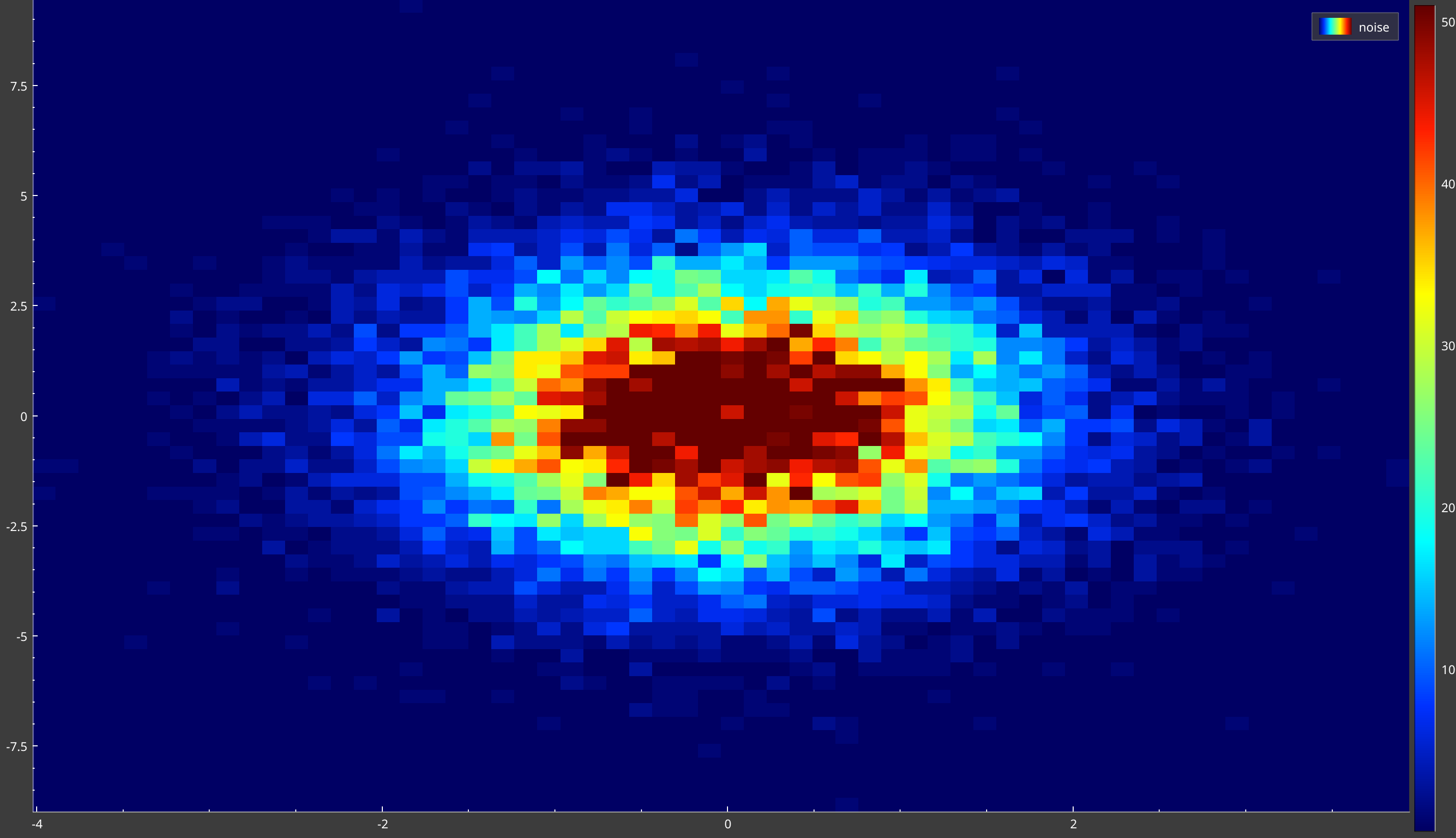
Bins, scales and gradient
x_bins/y_binsare integer bin counts, spread linearly over the data range by default. The example takeslog10inside the callback so that linear bins in log space are log bins. You can also keep the raw values and passx_bin_strategy=BinStrategy.Log/y_bin_strategy=BinStrategy.Loginstead (from SciQLop.user_api.plot.enums import BinStrategy). Log bins need strictly positive data.BinStrategy.SymLogexists but is not supported by the histogram yet, and explicit bin edges are not either.z_log_scale=True(orhist.z_log_scale = Truelater) puts the colour scale on a log axis. Use it whenever counts span several decades — otherwise the dense magnetosheath cluster saturates and the boundary track disappears.gradienttakes aSciQLopPlots.ColorGradientvalue, such asHot,Cold,Jet,ThermalorPolar.hist.gradient = ColorGradient.Coldchanges it afterwards. A name as a string, like"hot", works too, but in v0.13 only forCandy,Cold,HotandPolar.- The returned
XYPlotowns the axes:set_axis_label,set_x_range,set_y_range, andx_scale_type/y_scale_type(ScaleType.LinearorScaleType.Logarithmic). Keep the axes linear when the data is alreadylog10-transformed.
Pin the axes if the histogram jumps around while you pan. In v0.13, do it before you set the panel’s time range (see the warning below):
xy_plot.set_x_range(-2, 2)   # 0.01 to 100 cm^-3
xy_plot.set_y_range(0, 4)    # 1 eV to 10 keV
p.time_range = TimeRange("2015-10-16T00:00:00", "2015-10-19T00:00:00")
How the callback follows the time range
The callback signature is f(start, stop) -> (x, y) with start and stop as epoch floats, the same convention as
virtual products, so spz.get_data takes them directly. SciQLop calls it on every time range change: the time-range
bar, a zoom, a pan, or p.time_range = TimeRange(...). Return two empty arrays when there is nothing in the interval.
PlotPanel.time_range takes a TimeRange (ISO strings or datetime objects) or a (start, stop) pair. Set it after
the plots exist, and keep at least one time-series plot in the panel — the histogram is an XY plot and has no time
axis of its own to move.
Two v0.13 quirks
- A callback histogram stays empty until the panel’s time range changes. That is why the example sets
p.time_rangelast.- Panning or zooming the histogram’s own plot calls the callback with that plot’s x values as the time range.
set_x_rangedoes it too. Those “times” fall in 1970, so the histogram empties. Navigate with the time-series plot or the time-range bar instead. Settingp.time_rangeagain restores it.
Next release
Both quirks are fixed on SciQLop’s main branch. A callback histogram loads as soon as it is created, and it follows only the panel’s time range.
Each histogram2d call creates its own plot: a plot holds a single colour scale, so adding a second colormap-style
plottable to an existing plot raises RuntimeError. Use plot_index to choose where the new plot goes in the panel.
The histogram API is marked experimental: expect small changes.