In this tutorial we will learn how to plot data with SciQLop and the basic GUI interactions that will allow you to explore in situ measurements.
Plotting data
The easiest way to plot data with SciQLop is via the graphical interface. A more advanced workflow will enable you to plot data from Python scripts but we are not there yet.
The welcome page
SciQLop opens on its welcome page. The box at the top filters everything on the page as you type. Below it:
- JupyterLab opens a notebook environment inside SciQLop. See Opening JupyterLab below.
- New plot panel adds an empty plotting area, the starting point of this tutorial.
- Take a tour offers guided walkthroughs of SciQLop’s features, right in the interface.
- Recent workspaces: a workspace keeps your panels, notebooks and installed packages together. Click one to switch to it, or New workspace to start a fresh one. The Resume bar above reopens the last one.
- Examples: ready-made notebooks and virtual products. Click to expand, then add one to your workspace.
- Templates: panels you saved as plot templates. Click one to open it on any time range.
- Featured plugins: a few plugins from the Plugin Store. Browse all opens the store.
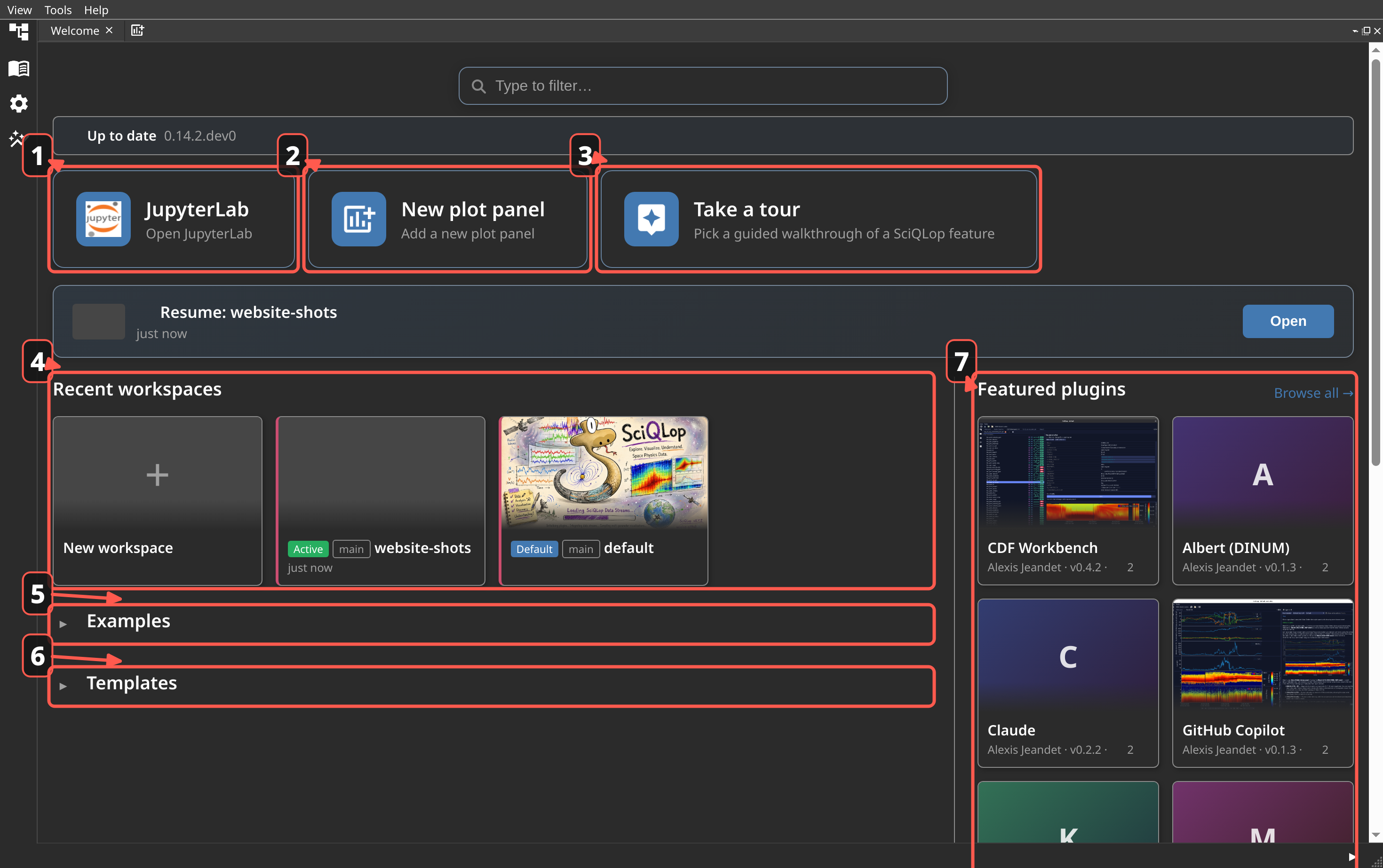
The welcome page is a tab like the others. If you close it, reopen it from the View menu.
Start window
The screenshot below shows you an empty SciQLop interface from which you can plot data. Three items are important here:
- the Products tab on the left side bar, where you can find all data accessible to SciQLop. Hover or click it to open it.
- the New plot panel button, which allows you to add a new plotting area.
- the time controls of the panel. Each panel has its own, in a row at its bottom: a start time (UTC) and a duration, one day by default.
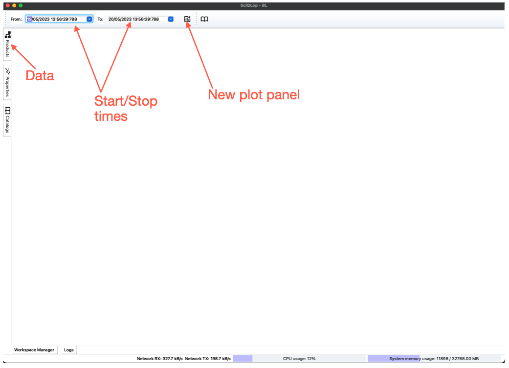
Drag and drop products to plot
You are ready to see data?
- click on New plot panel
- set the start time and the duration in the row at the bottom of the panel
- click on Products
- explore the product tree and drag and drop the product you want to see onto the plot panel
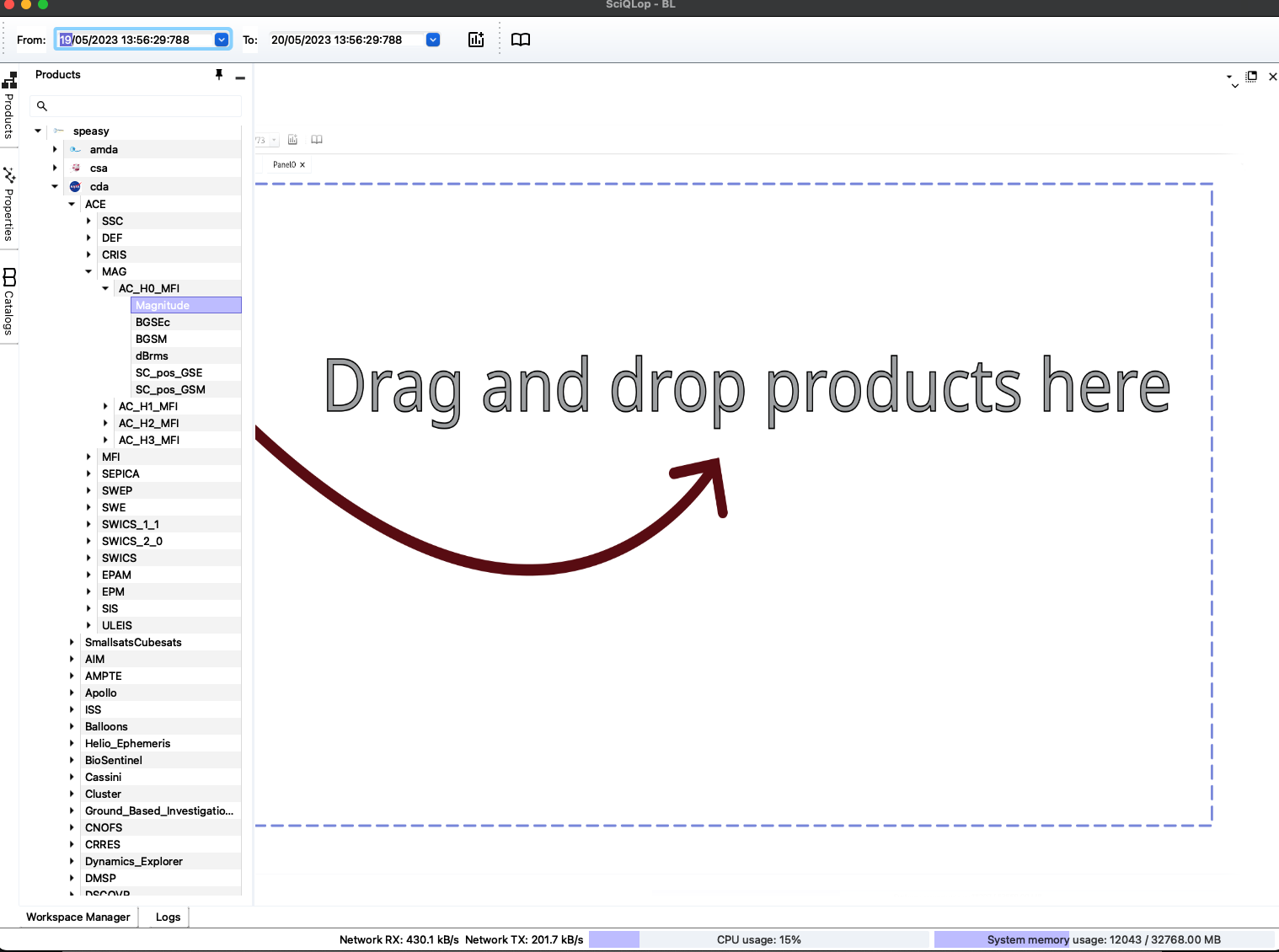
No need to dig through the tree
An empty panel shows a search box. Type a mission, an instrument or a parameter, like
ACE MAG, and pick a result to plot it. You can also right-click a product in the tree: the Plot in… menu offers the same choices as a drop, without dragging.
SciQLop will download the data for you and display it on the plot panel. Depending on your connection speed and whether you already have data in cache or not this may be either instantaneous or take up to several seconds.
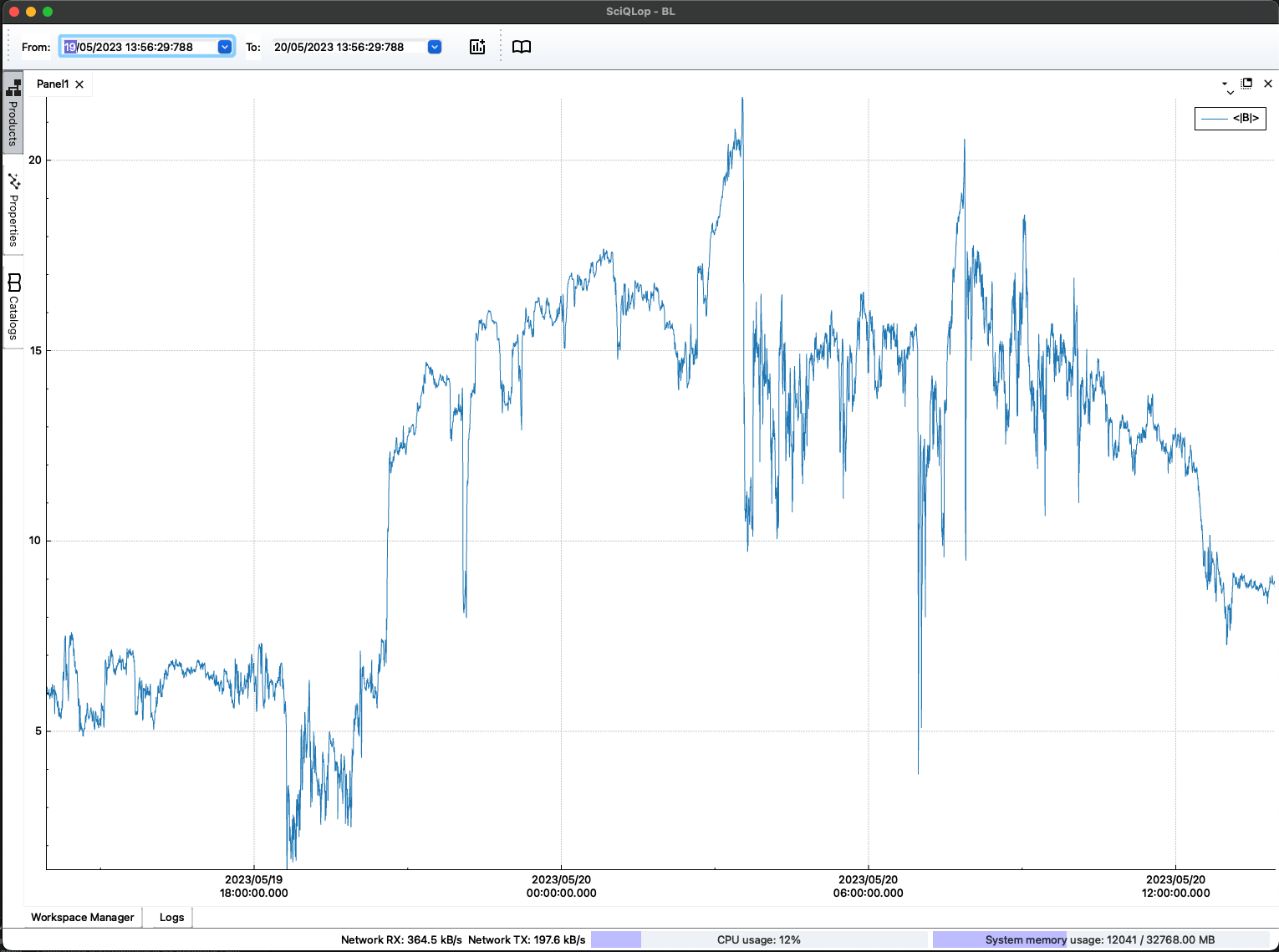
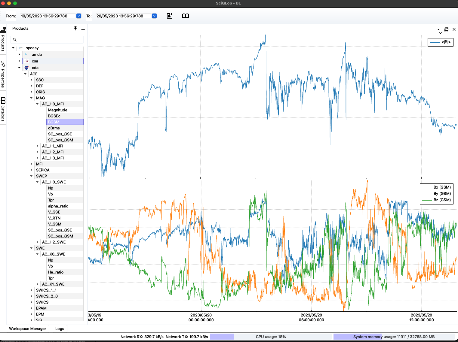
If all goes well you should see your data in the plot panel. In the above example we have selected the amplitude of the magnetic field measured by the ACE mission during one day.
You don't see your data, what could have gone wrong?
check your internet connection
move the mouse over the data product in the product tree and check the start/stop dates you have chosen are in the data range that should appear under the cursor.
Is your product part of the builtin plottable products?
It is so easy to get data with SciQLop that sometimes users are a bit ambitious on the start/stop times, and not seeing the data could be that it’s just taking a lot of time to download. Drag and dropping a month of MMS burst FPI data cannot and will not be fast ;-)
Check the network activity: click the small ▶ button at the right end of the status bar. It shows live network, CPU and memory usage. If SciQLop is downloading, you should see it there.
Let’s plot another product into the plot panel. We have two options:
- plot onto the previous plot: this is typically what you want to do if you have the same units, like plotting burst and non-burst particle density, or perpendicular and parallel temperatures
- plot in the same plot panel above or below another plot
Choosing between the two options simply consists in where you drop the product once selected from the product tree. Drop it in the middle of a plot to overlay it. Drop it near the top or bottom edge of a plot, where a blue highlight appears, to stack it as a new plot. In the following, we have chosen to plot the magnetic field vector components in the GSM coordinate system, underneath the magnetic amplitude.
Hiding curves
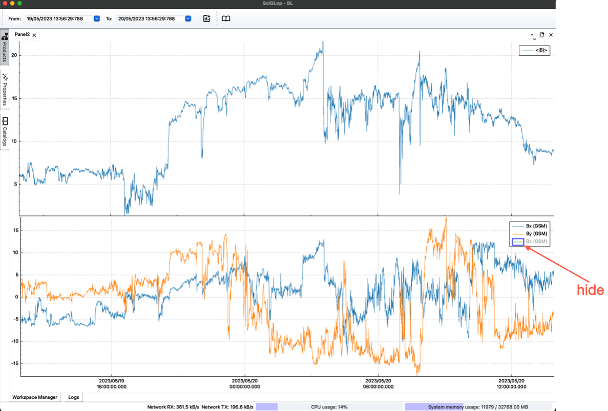
Sometimes it is useful to hide some of the curves displayed on a plot. Let’s say here we don’t want to see the Bz component. A vector shows one legend entry: click its ▸ marker to list the components. Then double click a component and it will hide the associated curve on the plot. Double click again, and the curve will reappear.
Browse data
The main advantage of SciQLop is that it allows you to browse data by just interacting with the plot. Let’s zoom out to see the context of the current interval. Doing so depends on your keyboard, either Cmd-wheel (macOS) or Ctrl-wheel.
Zoom limit
A new panel will not zoom out beyond one day. This keeps an accidental zoom from downloading months of data. To see more, pick a larger value in the Zoom limit box, at the bottom of the panel. The default lives in Settings.
Zooming in and out
The following screenshot shows the result of zooming out. The data previously taking the whole window now only appear in the central zone, surrounded by empty areas, because data is being downloaded.
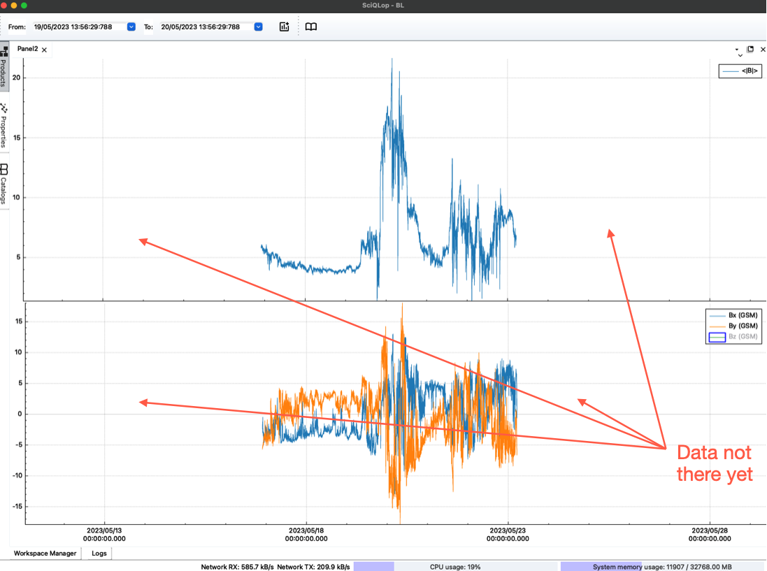
Download in progress
Have you noticed the network activity is showing download is in progress?
Ok data should arrive rapidly since in our example we are plotting low resolution vectors. It should even be almost instantaneous if you have data in cache. Once the download is finished data should appear
We now see the context: our day sat on an interplanetary shock, followed by a day of strong, turbulent field.
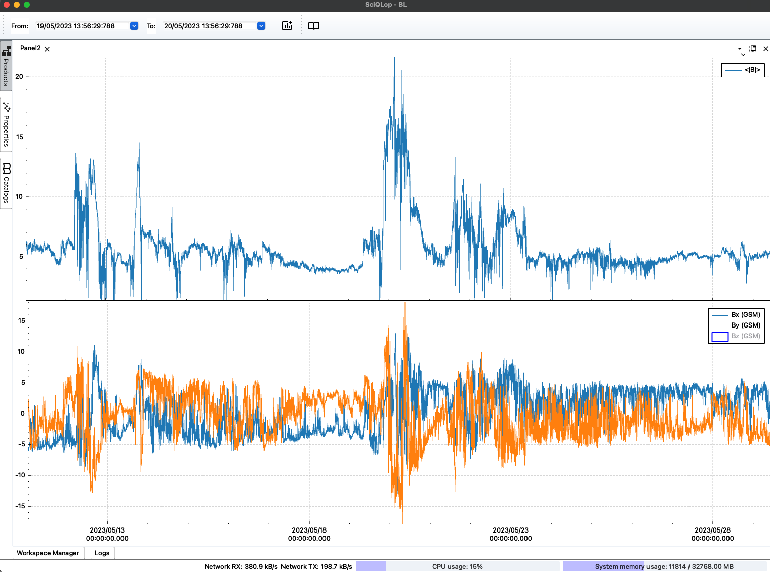
Zooming in is the exact opposite action
Going forward and backward in time
To see future or past measurements relative to the currently displayed interval, simply press the left mouse button in an empty area of the plot panel and move your mouse in the horizontal direction left/right to move into the future/past respectively. The mouse wheel alone does the same.
The arrows at the bottom of the panel step in time too. ◀ and ▶ move by one duration. |◀ and ▶| jump by five.
As for the zoom-out, data in the past and future times may not be in cache and it can take time to be displayed.
More wheel tricks
- Shift-wheel zooms the vertical axis.
- The wheel over an axis zooms that axis only.
- Press M over a plot to autoscale it.
- Right-click the panel for more: autoscale all plots, equalize plot heights, export as PNG or PDF, or copy the Python code that rebuilds the panel.
Plot properties
Sometimes we want to change the way the data is plotted. Click a plot or a curve, then open the Properties tab.
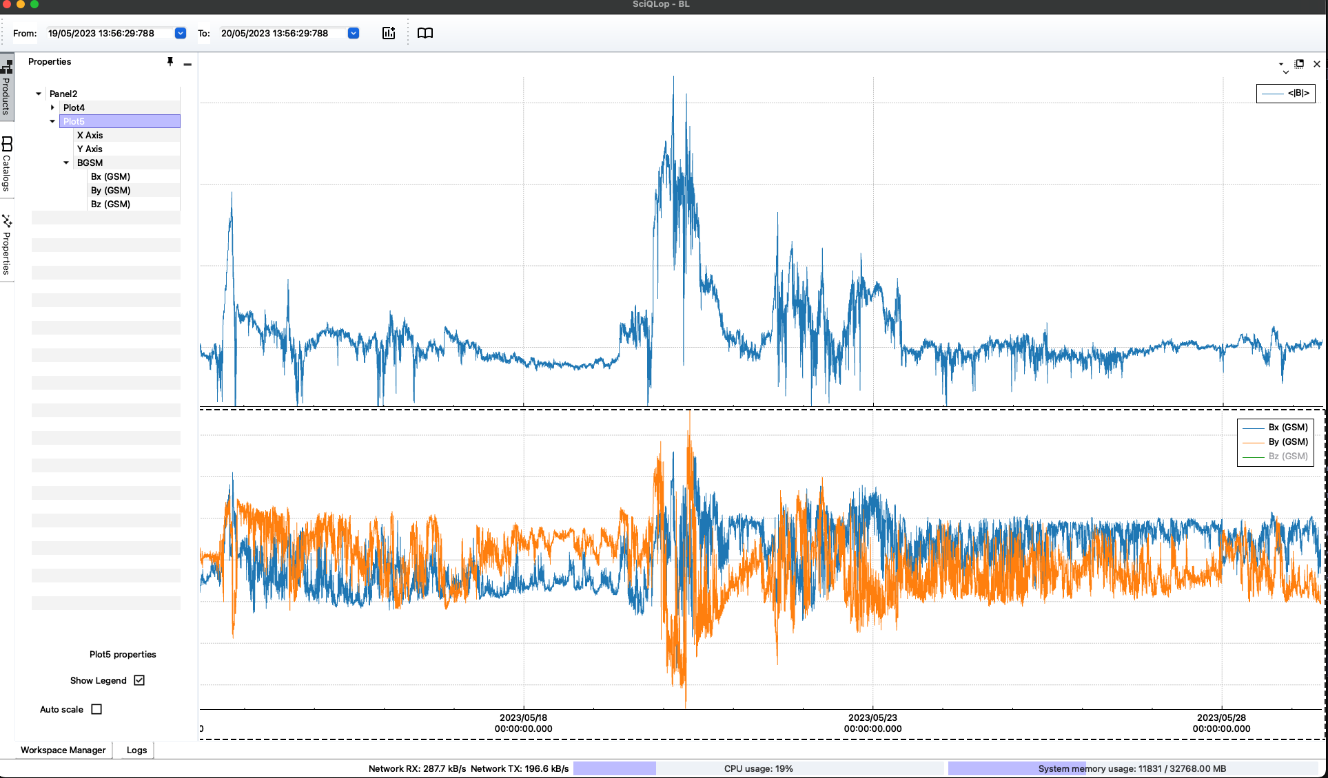
This will show a hierarchical tree of all SciQLop objects currently displayed, from plot panels down to curves. Each level in the hierarchy has its own properties. For instance above we have selected Plot0, the second plot of Panel0, which is visually represented by a dashed surrounding rectangle on the plot panel. At this level we can:
- hide/show the legend
- switch the crosshair read-out on or off
Each axis has its own entry. There you set the label, the log scale and the range. The Auto scale switch of the vertical axis lives there too.
At the level of the components Bx, By, Bz you will be able to change curve colors and styles.
panel and plot numbering
Panels and plots get their names in creation order, and a deleted one’s number is not reused. So after a few deletions the names can skip numbers. The first panel is
Panel0.
Deleting a panel / plot
Deleting a plot or a curve from the currently displayed view is done by pressing the
Deletekey on the selected item in the Properties tree. Dragging a plot up or down in that tree reorders the panel.
Opening JupyterLab
Everything in this tutorial works without code. When you want to script SciQLop, open JupyterLab: click the JupyterLab card on the welcome page, or use Tools › Open JupyterLab. It opens in a new tab, on its launcher. Click Python 3 (ipykernel) under Notebook to start a notebook.
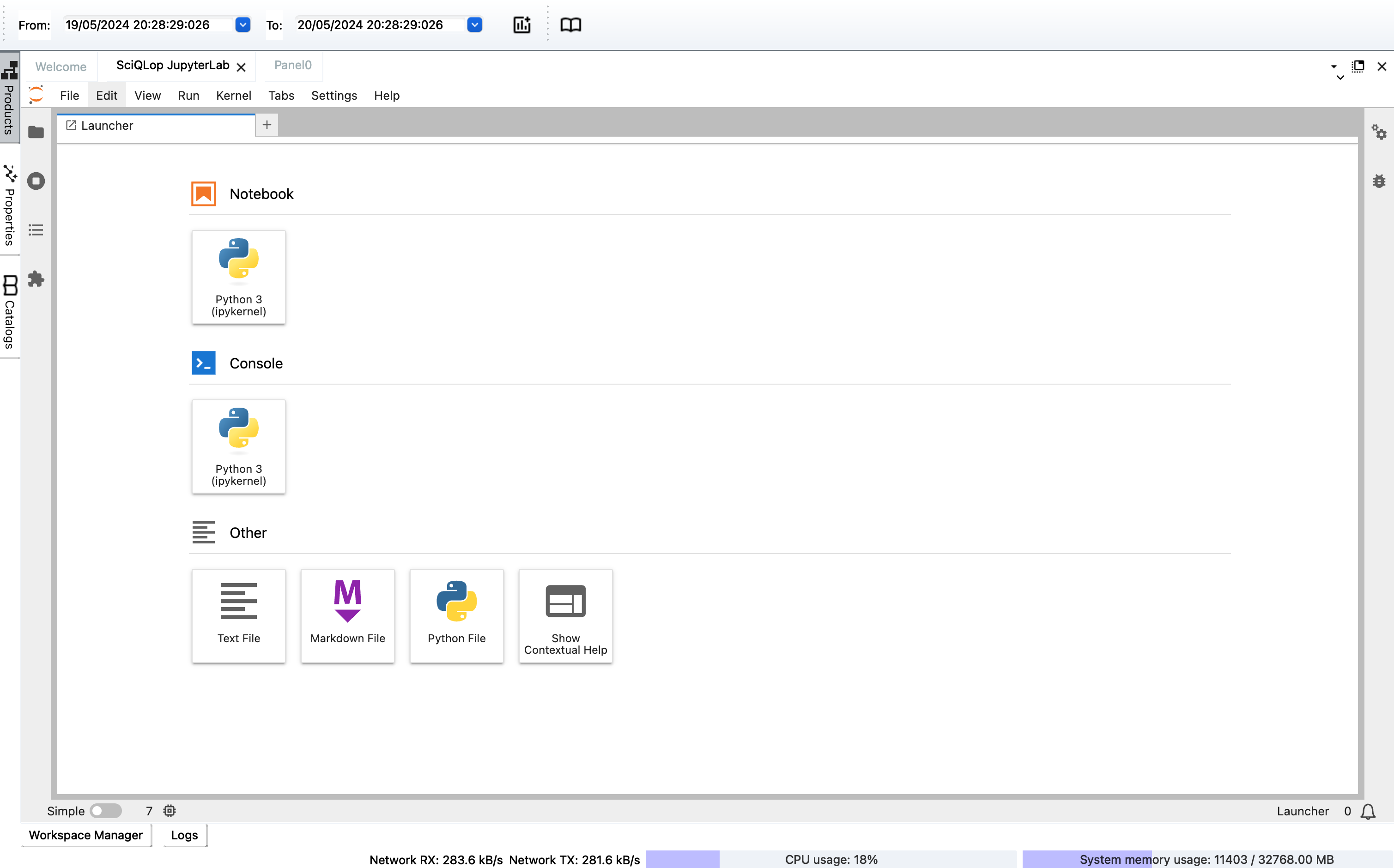
That notebook runs inside SciQLop: its cells can create panels, plot products and read the data on screen. The plot templates tutorial writes its first script there, and the Python API reference covers the rest.