Info to beginners:
This guide builds on the Python API and virtual products. Layers are an experimental API: signatures may still move.
A plot shows data. Very often what you actually want to see is your reading of that data: where the spacecraft was in the magnetosheath, where the density crossed a threshold, what threshold you used. An annotation layer is a Python function that returns those readings as Marker, Span or HLine objects, and SciQLop draws them on top of an existing plot. The function is re-run whenever its input changes, so the overlay follows you as you pan and zoom.
What a layer looks like
A layer is a function returning a list of annotations. It can take one of two shapes:
- range-only:
f(start, stop)receives the visible time range as floats (seconds since epoch) and is re-evaluated on every range change. - data-aware:
f(data: Scalar)receives the data of a graph on the plot, and is re-evaluated when that data changes. Type-hintdatawithScalar,Vector,MultiComponentorSpectrogramand SciQLop picks the matching graph.data.timeis a 1D array of seconds,data.valuesa 2D array of shape(N, ncomponents).
The three annotation types:
from SciQLop.user_api.layers import Marker, Span, HLine

Marker(time=1.0e9, value=5.0)                                 # a point on the plot
Span(start=1.0e9, stop=1.0e9 + 60, label="sheath", color="#e67e22")  # a shaded time interval
HLine(value=5.0, color="#e74c3c")                             # a horizontal reference line
Extra keyword arguments with a default become knobs in the Properties panel, exactly as for virtual products. Wrap the type in Annotated[..., Knob(...)] to set bounds, step, unit or label.
The example: a magnetosheath detector
We use the MMS1 magnetopause crossing of 2015-10-16 around 13:07. The ion density jumps by an order of magnitude between the magnetosphere and the magnetosheath, so a density threshold is a decent detector. Open a notebook from the welcome page and plot the burst-mode density and magnetic field:
from datetime import datetime
from SciQLop.user_api import TimeRange
from SciQLop.user_api.plot import create_plot_panel

MMS1 = "speasy//cda//MMS//MMS1"
DENSITY = f"{MMS1}//DIS//MMS1_FPI_BRST_L2_DIS_MOMS//mms1_dis_numberdensity_brst"
B_GSM = f"{MMS1}//FGM//MMS1_FGM_BRST_L2//mms1_fgm_b_gsm_brst_l2"

p = create_plot_panel()
p.time_range = TimeRange(datetime(2015, 10, 16, 13, 5, 25), datetime(2015, 10, 16, 13, 7, 35))
p.plot(DENSITY)
p.plot(B_GSM)
NOTE: Product paths are
//-separated.time_rangetakes aTimeRangeor a(start, stop)pair.
Now the layer. It reads the density (a Scalar), shades every interval above the threshold, puts a marker on each crossing and draws the threshold itself as a line:
import numpy as np
from typing import Annotated
from SciQLop.user_api.layers import register_layer, Marker, Span, HLine, Scalar
from SciQLop.user_api.knobs import Knob

@register_layer("mms/magnetosheath", scope="panel")
def magnetosheath(
    data: Scalar,
    threshold: Annotated[float, Knob(min=0.0, max=50.0, step=0.5, unit="cm^-3")] = 5.0,
) -> list[Marker | Span | HLine]:
    n = data.values[:, 0]
    t = data.time
    if n.size < 2:
        return []
    inside = (n > threshold).astype(np.int8)
    crossings = np.flatnonzero(np.diff(inside)) + 1
    edges = np.flatnonzero(np.diff(np.concatenate([[0], inside, [0]])))
    spans = [Span(start=float(t[a]), stop=float(t[b - 1]), label="magnetosheath", color="#e67e22")
             for a, b in zip(edges[::2], edges[1::2])]
    markers = [Marker(time=float(t[i]), value=float(n[i])) for i in crossings]
    return spans + markers + [HLine(value=threshold, color="#e74c3c")]
@register_layer puts the function in the product tree under Layers/mms/magnetosheath, so you can drag it onto the density plot like any product. It is optional when you attach from Python:
layer = p.add_layer(magnetosheath, plot_index=0, scope="panel", threshold=8.0)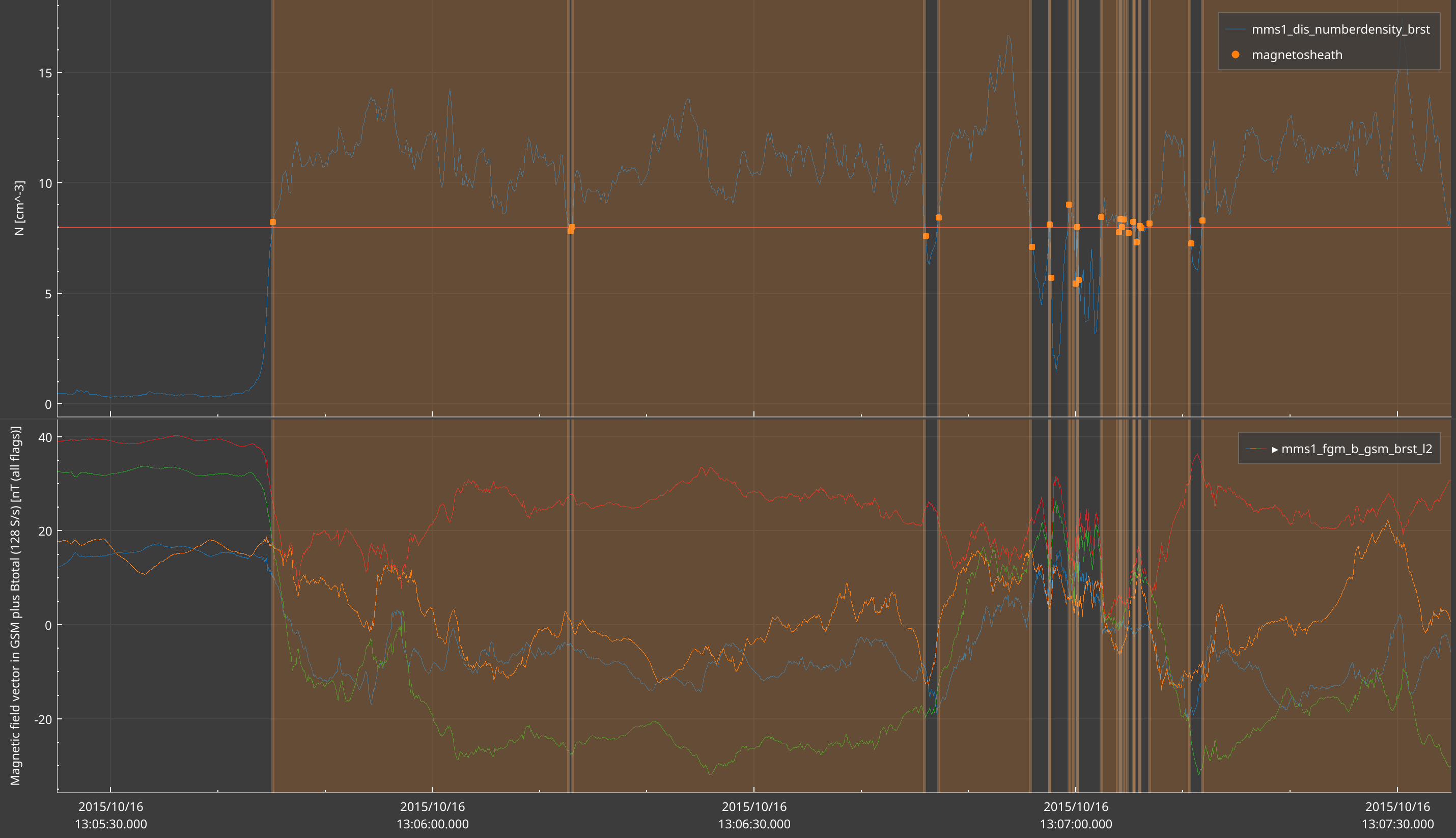
plot_index selects the subplot that provides the data and receives the markers and line. Extra keyword arguments set the initial knob values. The knobs show in the Properties panel, in a section named after the function: under the panel for a panel-scoped layer, under the plot otherwise. Move the threshold knob there and the spans, markers and line update live.
About scope. By default a data-aware layer is plot-scoped: its spans stay on the plot it reads from. scope="panel" draws the spans across every plot of the panel, which is what we want here: the sheath intervals shade the B-field plot too. Note that add_layer has its own scope argument; the one given to @register_layer only applies to drag-and-drop. HLine and Marker always stay on the target plot, whatever the scope.
From a notebook cell: %%layer
The %%layer cell magic registers the function in the cell and hot-reloads it every time you re-run the cell. Marker, Span and HLine are injected for you; everything else you import yourself.
%%layer --path "mms/magnetosheath" --scope panel
import numpy as np
from typing import Annotated
from SciQLop.user_api.layers import Scalar
from SciQLop.user_api.knobs import Knob
def magnetosheath(data: Scalar, threshold: Annotated[float, Knob(min=0.0, max=50.0, step=0.5)] = 5.0) -> list[Marker | Span | HLine]:
    ...
Test the function in a cell first
When a layer callback raises, the layer renders nothing. On the plot, that looks exactly like “no crossing found”. The error is logged, and the layer object returned by add_layer keeps it:
print(layer.last_error)   # None when the last call went fine
layer.callback_failed.connect(print)   # a Qt signal, emitted with "<function>: <error>"
Still, the quickest fix loop is to call the function yourself before attaching it. Fetch the same data with Speasy and wrap it in a Scalar:
import numpy as np
import speasy as spz
from SciQLop.user_api.layers import Scalar

density = spz.inventories.data_tree.cda.MMS.MMS1.DIS.MMS1_FPI_BRST_L2_DIS_MOMS.mms1_dis_numberdensity_brst
v = spz.get_data(density, "2015-10-16T13:05:25", "2015-10-16T13:07:35")
seconds = v.time.astype("datetime64[ns]").astype(np.int64) / 1e9
magnetosheath(Scalar(seconds, v.values), threshold=5.0)
You should get a short list of Span, Marker and one HLine. If it raises, fix it here, not on the plot.
Good to know
- Colours can be a Qt name (
"orange"),#RRGGBB, Qt’s#AARRGGBB, or CSSrgb(...)/rgba(...). An unknown colour falls back to the default and logs a warning. Spans are drawn semi-transparent unless your colour carries its own alpha.Marker.color,Marker.labelandHLine.labelare accepted but not drawn yet; aSpan.labelshows as a tooltip.Knob(widget="hline")on a float knob also draws it as a draggable horizontal line on the plot. Try it onthreshold: dragging the line retunes the detector, and theHLinein the return value becomes redundant.