Plots
panel.plots and every plot call give you plot objects. TimeSeriesPlot and XYPlot share most of their
methods. ProjectionPlot is different.
Common to time-series and XY plots
| Member | What it does |
|---|---|
plot.plot(...) | Adds a graph to this plot. See below. |
plot.scatter(x, y, *, labels, name, colors, **kwargs) | Adds a scatter graph, filled circles by default (experimental). |
plot.histogram2d(x, y, ...) | Adds a 2D histogram to this plot (experimental). |
plot.waterfall(x, y, z, ...) | Adds a waterfall to this plot (experimental). |
plot.add_hline(value, *, color=None, movable=False) | Adds a horizontal line, returns a HorizontalLine (experimental). |
plot.remove_graph(graph) | Removes a graph you got from plot, scatter, … (experimental). |
plot.set_x_range(lo, hi) / plot.set_y_range(lo, hi) | Sets an axis range. Bounds are swapped if reversed. |
plot.y_scale_type | ScaleType.Linear or ScaleType.Logarithmic. Settable. |
plot.set_axis_label(axis, label, unit=None) | Labels "x", "y", "y2" or "z". The unit shows as label [unit]. |
plot.set_axis_scale(axis, ScaleType.Logarithmic) | Sets one axis to linear or log. |
plot.set_axis_range(axis, lo, hi) | Sets one axis range. |
plot.set_axis_type(axis, AxisType.DateTime) | Linear, Logarithmic or DateTime. |
plot.apply_hints(hints) | Applies a PlotHints bundle (labels, units, scales) at once. |
plot.rescale_axes() | Fits the axes to the visible data. Set the X or time range first. |
plot.replot() | Forces a redraw. |
plot.overlay | The plot’s message overlay. See Messages over a plot. |
plot.plot_type | PlotType.TimeSeries or PlotType.XY. |
The secondary Y axis on the right (experimental):
| Member | What it does |
|---|---|
plot.y2_visible | Show or hide the right axis. |
plot.y2_scale_type | Linear or log right axis. |
plot.set_y2_range(lo, hi) | Right axis range. |
graph.y_axis = "y2" | Move an existing line to the right axis. |
from SciQLop.user_api.plot import ScaleType

b_plot, _ = p.plot(FGM)
_, n_graph = p.plot(DENSITY, plot_index=0)    # density on the same axes as B
n_graph.y_axis = "y2"                         # ... but against the right axis
b_plot.y2_visible = True
b_plot.y2_scale_type = ScaleType.Logarithmic
b_plot.set_y2_range(0.1, 100)
b_plot.set_axis_label("y", "B", "nT")
b_plot.set_axis_label("y2", "n", "cm^-3")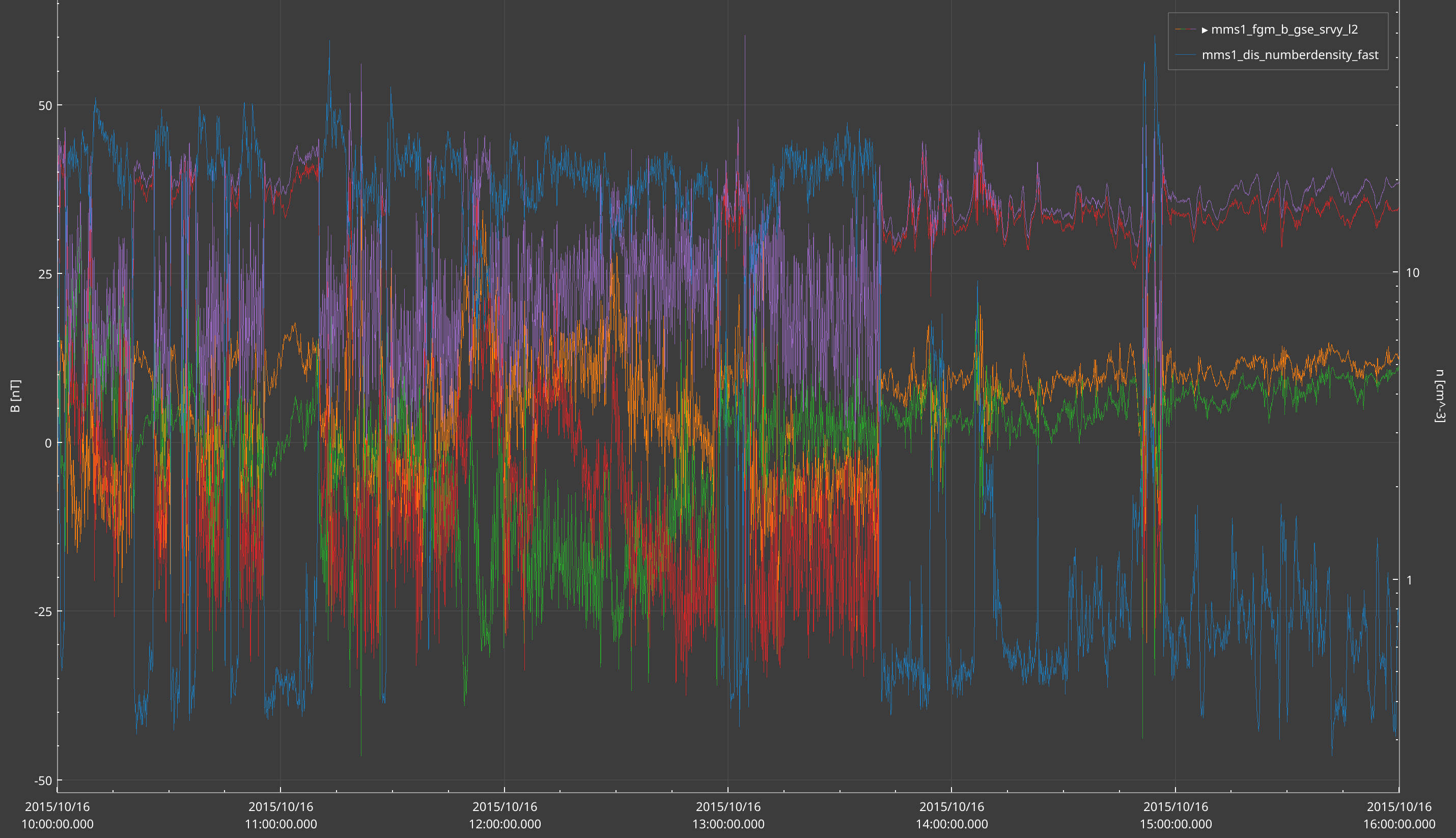
A plot has a single colour scale. Adding a second colormap, histogram or waterfall to the same plot raises
RuntimeError. Colormaps cannot live on y2; y_axis="y2" is ignored for them.
TimeSeriesPlot
The X axis is time and it is shared with the whole panel.
graph = ts_plot.plot(*args, labels=None, name=None, colors=None, graph_type=None,
                     y_log_scale=False, z_log_scale=False, line_style=None, y_axis="y", **kwargs)
It accepts a product path, a function f(start, stop), (x, y) or (x, y, z). It returns the graph only, not a
tuple. With a product path, labels= raises TypeError; name= works on every path.
| Member | What it does |
|---|---|
ts_plot.time_range | Get or set this plot’s time range. |
ts_plot.set_x_range(start, stop) | Same as setting time_range, with any datetime-like bounds. |
ts_plot.set_y_scale_type(scale) | Same as y_scale_type = scale. |
XYPlot
Any quantity on both axes. You usually get one from panel.histogram2d or plot_type=PlotType.XY.
graph = xy_plot.plot(x, y)          # a curve
cmap = xy_plot.plot(x, y, z)        # a colormap
graph = xy_plot.plot(f)             # a function f(start, stop) -> (x, y)
A product path is rejected here with ValueError. xy_plot.x_scale_type and xy_plot.y_scale_type set the
scales.
ProjectionPlot
A projection plot draws vector data as several 2-D projections, one panel per pair of components. Give it a three-component product, like a velocity or a spacecraft position.
VI = "speasy//cda//MMS//MMS1//DIS//MMS1_FPI_FAST_L2_DIS_MOMS//mms1_dis_bulkv_gse_fast"
proj, graph = p.plot_product(VI, plot_type=PlotType.Projection)
proj.set_x_range(-500, 500)
proj.set_y_range(-500, 500)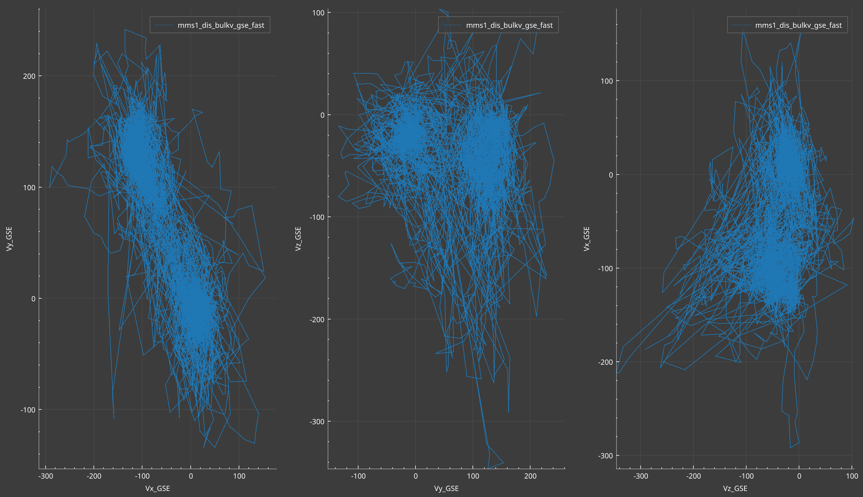
| Member | What it does |
|---|---|
proj.plot(product) | Adds a product. |
proj.set_x_range(lo, hi) / proj.set_y_range(lo, hi) | Applies to every projection. |
proj.set_x_scale_type(scale) / proj.set_y_scale_type(scale) | Applies to every projection. |
proj.set_axis_type(axis, axis_type) | axis is "x" or "y". |
proj.plot_time_colored_curve(x, y, t, *, z=None, name=None, colormap="viridis") | A curve coloured by time (experimental). Needs one array per projection: pass z on a 3-projection plot. |
A projection plot has no overlay, no axis labels and no y2 axis. That is by design: it is a different widget
from the other plots, a grid of 2-D projections, so those features don’t exist there.
Messages over a plot
Every time-series and XY plot has an overlay for in-canvas messages.
from SciQLop.user_api.plot import OverlayLevel, OverlayPosition, OverlaySizeMode

b_plot.overlay.show("Burst data only after 13:00", level=OverlayLevel.Warning,
                    size_mode=OverlaySizeMode.FitContent, position=OverlayPosition.Top)
b_plot.overlay.collapsible = True
b_plot.overlay.clear()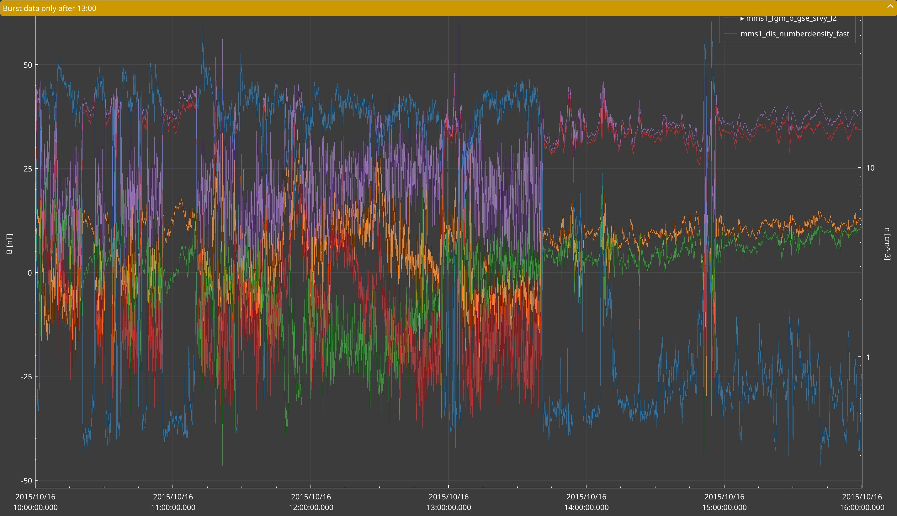
show and clear are experimental. text, level, position and size_mode read the current message.
collapsible, collapsed and opacity are settable. Don’t keep the overlay object: read plot.overlay again
each time.
Graphs
The second value returned by plot calls is a graph handle. Its type depends on what was drawn.
| Type | Members |
|---|---|
Graph (lines, curves, scatter) | data, set_data(x, y), visible, y_axis |
ColorMap | data, set_data(x, y, z), visible |
Histogram2D | data, set_data(x, y), visible, z_log_scale, gradient, x_bin_edges, y_bin_edges |
Waterfall | data, set_data(x, y, z), visible, offsets, gain, normalize, colors, color, line_count |
graph.visible = False
graph.set_data(t, y * 2)          # replace static data
x, y = graph.data
set_data replaces data you plotted from arrays. A graph fed by a product or a function gets new data on every
time range change.
Once its plot or panel is closed, a handle raises ValueError: The graph does not exist anymore. The same goes
for plots, panels and items.
Colours and gradients
- Colours of primitives, waterfalls and overlays are Qt colour strings: a name like
"red","#RRGGBB", or"#AARRGGBB"for transparency. CSSrgba(...)is not understood.
Next release
Every plot item accepts CSS
rgb(...)andrgba(...): lines, spans, text, ellipses, curves, waterfall and timeline colours. A colour string SciQLop can’t read raisesValueErrorinstead of silently drawing nothing.
colors=on plot calls takes one colour per component.QColorobjects are the safe choice there.- Gradients are
SciQLopPlots.ColorGradientvalues, likeColorGradient.JetorColorGradient.Thermal.hist.gradient = ColorGradient.Hotsets one. - In v0.13.1, a gradient given by name (
"hot") only works forCandy,Cold,HotandPolar. Other names raiseValueError. Use the enum value.
Next release
Every gradient can be given by name:
hist.gradient = "thermal".
Next release: timelines, steps and text ticks
Next release
These ship after v0.13.1.
- Step lines.
plot_data(...)andplot.plot(...)takeline_shape=LineShape.StepLeft(alsoStepRight,StepCenter,Line).gap_threshold=0stops a line graph from breaking at long flat stretches. Both are alsoGraphproperties.from SciQLop.user_api.plot import LineShape.- Text ticks.
plot.set_axis_tick_labels("y", {0: "MAG", -1: "SWA"})shows names instead of numbers.Nonerestores the numbers.- Legend.
plot.legend_visible = Falsehides a plot’s legend.- Listing graphs.
plot.graphslists a plot’s graphs in draw order. Every graph has aname.plot.remove_graph(plot.graphs[0])removes the first one.- Interval timelines (experimental).
plot, tl = panel.add_timeline()adds a plot of named lanes, andts_plot.add_timeline()adds a strip to an existing plot. Fill it withtl.set_intervals(start, stop, lane=[...], category=[...], label=[...], ids=[...]). Times can be epoch seconds,datetime64, datetimes or date strings.tl.on_edit,on_create,on_delete,on_hoverandon_selectionreport user actions back with your ids. Edits are proposals: the timeline only changes when you callset_intervalsagain.- Panel menus.
register_panel_menu(title, entries)adds a submenu to every panel’s right-click menu.entries(panel)returns(label, callback)pairs.unregister_panel_menu(title)removes it.